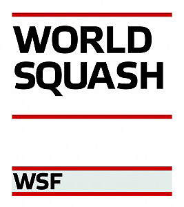
WSF Unveils New Corporate Logo
by Howard Harding


20 September 2011 - The World Squash Federation today launches a bold new visual identity.
The WSF's new corporate logo is intended to achieve a clear, consistent visual identity that not only emphasises the position and role of the Federation, but also has the adaptability to enable it to be used in a variety of ways in respect of WSF programmes and initiatives.
In a creative way it uses the lines of the front wall of a squash court to give a visual cue towards squash. It has authority, strong lines and colours and is part of a full rebranding that will ensure instant recognition of WSF.
WSF President N Ramachandran commented: "We are a bold organisation and want to reflect that in how we look. In simple terms, WSF is a brand and we have to present this effectively to our stakeholders and all to whom we relate."
WSF Chief Executive Andrew Shelley added: "The flexibility of design and colour is important, so that we can give separate identities to all our schemes. We are heartened by positive reaction from those who have seen the designs so far and we hope that the entire world of squash will be similarly upbeat now that it is released."
Back To Main
